Filed under: Uncategorized.
If you come and visit Quebec City, you’ll soon make the acquaintance of Matante and Chipie and their squad. You’ll find them on highway billboards, on the side of buses and at many points of sale. These colourful characters are the faces of the beer brewed by Archibald, microbrewery and restaurant. And what if we were to say that it’s thanks to 3D that they have such a healthy glow?
Why Choose 3D?
Archibald’s vibrant brand image is the brainchild of 360° communications agency Bleuoutremer, and there’s an important distinction to be made between the work done by this creative agency and the work of the 3D studio. It was the agency that came up with the idea and designed the characters and labels. It was only when the time came to promote the products that Kub Studio stepped in.
Having worked in the field for twenty years or so, the designer of the Archibald project had long-standing knowledge of 3D. However, it has not always been the first-rate creative solution it is today. Technology was not as sophisticated in the past and 3D looked like… well, like it was in 3D! But it has advanced rapidly over the years, paving the way for uncannily lifelike renders. And it is thanks to these hyper realistic results, which can be modelled even down to the finest details, that 3D has become, in many cases, a more affordable option than photography.
In the case of Archibald, this thought process was prompted by the shrink wrap packaging, the kind that’s made of a plastic material that shrinks when heat is applied to it and is often used to package drink cans.
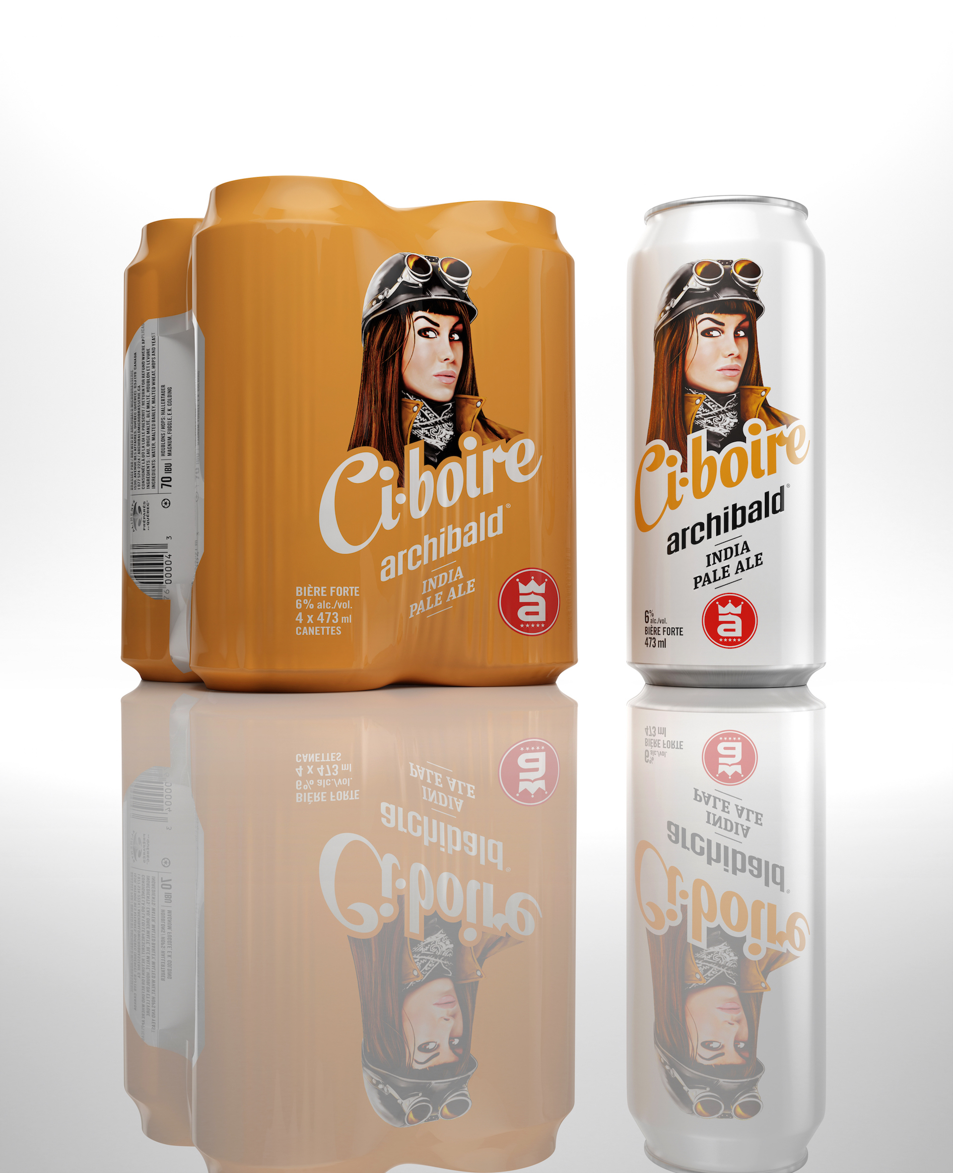
Although it’s practical, there are little wrinkles in the corners that cast shadows over the cans. And you can’t sell a dream with little wrinkled corners. That’s why the team opted for the “perfection” that can be achieved with 3D. The technique allowed us to recreate the packaging, and it was not only realistic, but also much more photogenic.
The 3D Studio’s Role in the Project
Our studio was mandated by Bleuoutremer to produce the “photos” for both the cans and packaging. We therefore embarked on this process at about the same time as a photographer would have done. We say “about” because with 3D, you can get started sooner: you don’t need the physical product to create the image.
The agency provided us with a moodboard or, at the very least, information regarding the type of images they were looking for: angles of view, product size, lighting, etc. They also gave us the digital labels in two dimensions (and the physical labels) to work with. Our task therefore was to render the cans and the packaging, and then apply the product labels.
Rendering, that is to say creating a 3D digital model of an object, is the stage in a 3D project that can seem daunting, as it’s the one that requires the most resources. However, it can turn out to be very cost-effective over time. For example, Archibald’s cans are all the same shape and size. As such, we can use the same rendering of the can and simply apply the different labels. The concept becomes all the more profitable if there are several images that need to be produced or the aim is a long-term partnership.
The Advantages of Presentations on a White Background
As Kub Studio President Richard so aptly puts it, “white backgrounds aren’t an advantage, they’re a necessity!”
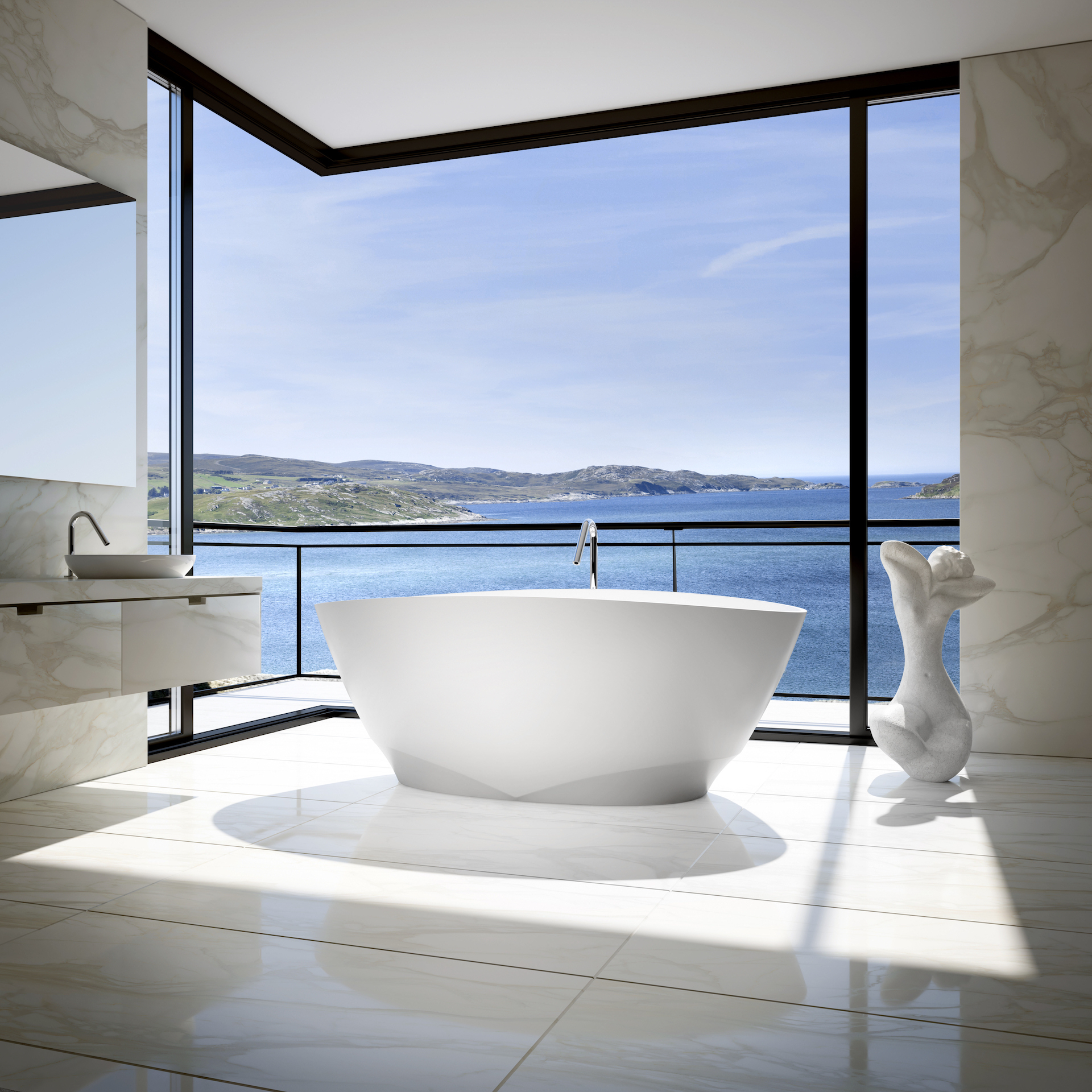
Client: BainUltra
It’s first and foremost the atmosphere of an image that will engage the customer. We can never emphasize this enough: customers aren’t shopping for a bathtub, they’re redoing their bathroom. They’re looking for a lifestyle, an atmosphere where they can maybe sit back and relax after a hard day’s work. But once we’ve appealed to their emotions with the atmosphere, we need to justify the reasons for purchasing it.
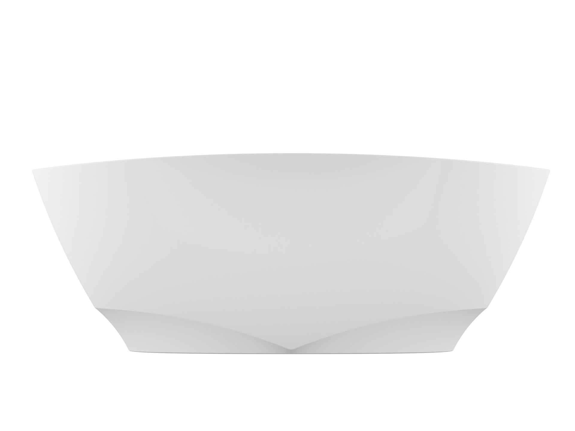
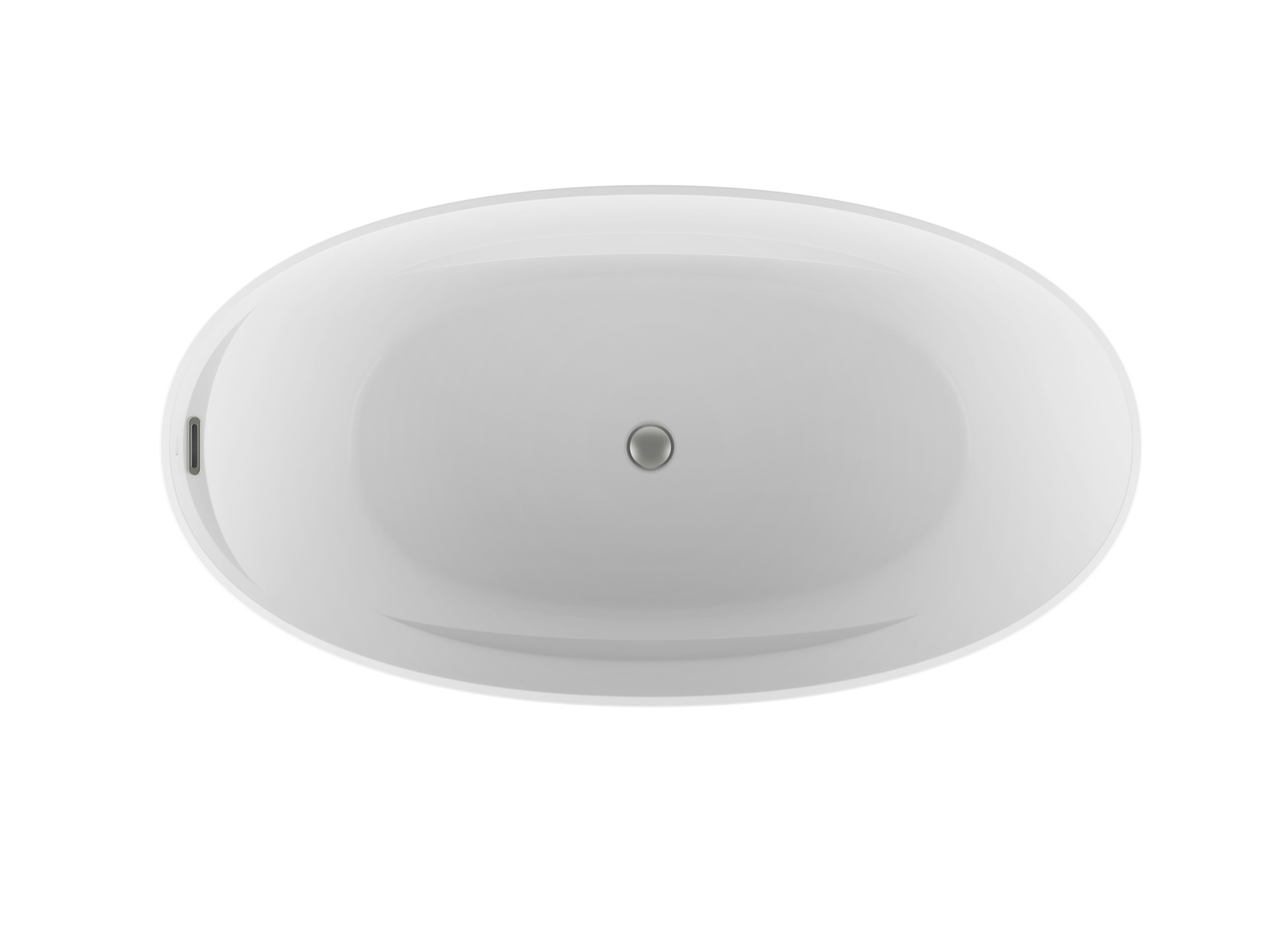
An image of a product on a white background is the kind that accompanies the technical specifications of the product. It’s for information purposes and provides details about the product and its functionalities. It makes the product appear more concrete in the eyes of the customer, and that’s what finalizes the buying decision process.
In the case of Archibald, the strong brand image appeals to people’s emotions and, thanks to 3D, this brand image can be transposed onto the real products.
The Ways They Can Be Used
If images on a neutral background appear mundane, it’s because we’re so used to seeing them. They’re literally everywhere!
For years, they have been the very essence of printed catalogs and they still are, but now they’ve entered the digital era. It’s what the technical data sheets we described earlier are all about. Thanks to 3D, these catalogues can now provide 360° views. Once an object has been rendered, you can move it about any which way you like and view it from every possible angle.
Images on a white background can also be used in all forms of advertising, both printed and on screen. Like the Archibald images, which can be seen on advertising boards of all sizes. They also adorn the displays at points of sale. Next time you pop to the corner store or supermarket, take the time to see how many signs show a perfect product next to its price (and yes, that could be our work!). They are also featured in numerous TV commercials.
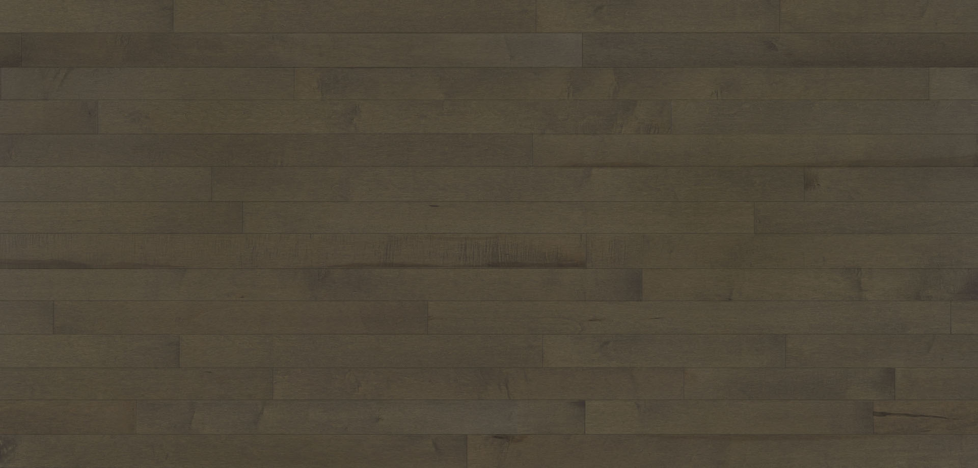
Pictures of samples, or swatches, are also a type of image with a neutral background, and they are essential when it comes to presenting a specific finish or texture. They are often used for floor coverings, wallpaper, textiles, etc.

It’s Not All White
“But wait… didn’t you just say an image on a neutral background?”
Oh yes! Up to now, we’ve talked mostly about white backgrounds. However, the central principle is not the background colour but its neutrality, the fact that nothing in its environment impinges on the product.
We can therefore bring any colour into play that will aptly showcase the product or its brand image. For example, because of its neutrality, black is another popular background colour and using it is mainly a matter of aesthetics. The final decision is always down to the customer.
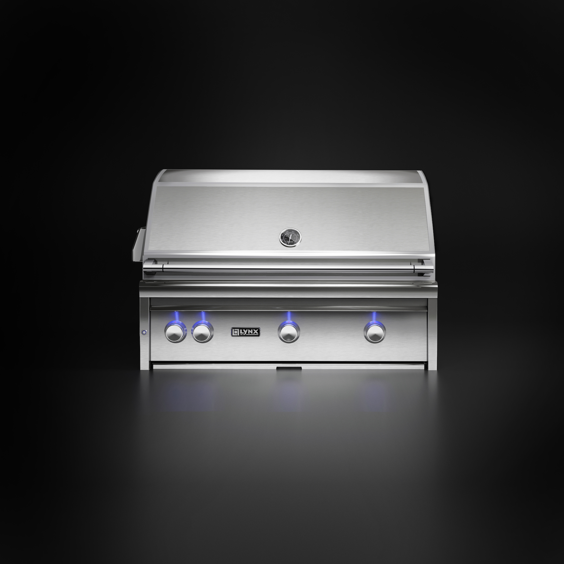
Client: Lynx Grills
A neutral background can also mean no background. If an image is created on a particular background, the client will be “stuck” with it. Sometimes, that’s just fine: presenting a product on a nondescript background is exactly what’s called for! But at other times, it’s best to render the product without a background so that the customer will be able to position it on the backdrop of their choice.
If there’s one thing to remember about the Archibald case, it’s that 3D is all around us in everyday life. You see the results when driving to work, on your screens and on the packaging of the products in your kitchen cupboards. The better the quality of the work, the more its presence in our lives will be subtle. It’s the quiet strength behind meticulous and artistic visual projects… or simply behind a can of beer. On that note, you’ll have to excuse me, it’s happy hour.
Filed under: Uncategorized.
Questions about neutral background presentation?
Contacts us!Read more
View all posts